
Watch the shape of the yield curve
Genevieve Signoret
(Hay una versión en español de este artículo aquí.)
Yes, U.S. Treasuries continue to trend down. This is not a great concern for us. We buy these mostly for insurance against our recession scenario. What has us a bit on edge, however, is the evolving shape of their yield curve.
Although stocks did not react as one might have expected to the Fed’s newly hawkish stance, yields on U.S. Treasury securities did: they held to their upward trend. This triggered, of course, further upward shifts in the yield curve:
The UST yield curve is shifting up. No surprise (or alarm) here.
Chart 1. U.S. Treasury yield curve today, March 15, and at the end of last year (% per annum)
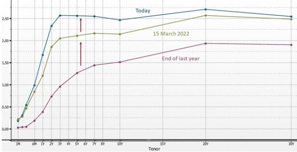
We’re relaxed about the increase in Treasury yields (the upward shift in the yield curve). Bond yield increases are par for the course both for a Fed tightening cycle and a small recovery in risk appetites. What’s causing us some tension, however, is that the yield curve continues to flatten. It started doing so about a year ago:
What’s unsettling us is how the US Treasury yield curve continues to flatten
Chart 2. U.S. Treasury yield curve today and a year ago (% per annum)
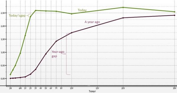
Notice in Chart 2 how close together yields on the 10-year bond and the 2-year note have crept. Should this gap turn negative (and stay that way for more than a few days)—that is, should the yield curve invert—it could be a harbinger of a near-term recession.
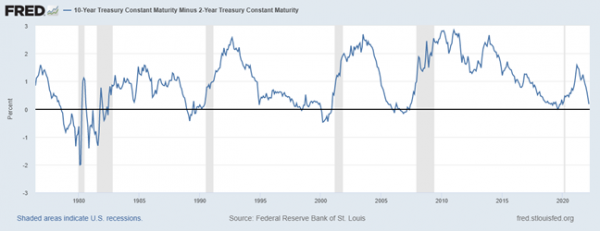
A quick glance at the following chart of the gap should tell you why: recessions tend to follow sustained periods of yield curve inversion.
Below-zero values on this chart indicate yield curve inversion, historically a harbinger of recession
Chart 3. Gap between the yield paid by a 10-year U.S. Treasury bond and that paid by a 2-year note
Are you a global market investor or business leader? If so, then we recommend that you keep a sharp eye on the evolving shape of the U.S. Treasury yield curve.